Tag : painting

128 posts

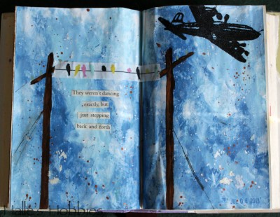
birds on a wireI know that title looks like I don’t know the difference between two and too but in this case two is the proper usage.

The challenge was to use at least two different blues in your artwork. I used way more than two.  :)

After I got all the background finished it looked like a sky to me. Since I have some fun bird on a wire washi tape I painted in some telephone poles so they’d have somewhere to perch. The plane was an afterthought but I think it was needed to give some depth to the page.

I imagine myself laying on the ground, listening to the birds in between planes coming in for a landing at the nearby airport.

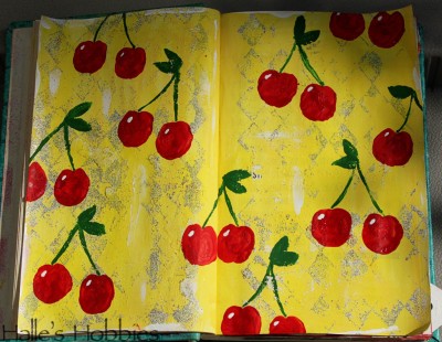
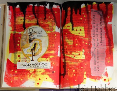
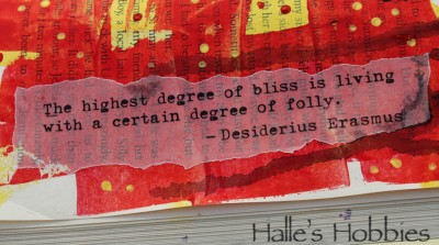
cherries red and yellow red and yellow quote

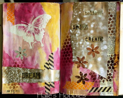
Time is flying!! It’s week 5 of Summer of Color already!

These colors always make me think of feed-sack cloth, vintage aprons and kitschy kitchens.

So what else could I do but an ode to a simpler time.

Not wanted to waste the extra paint I scraped it on another book page. After finishing the cherries page I love the look of the pages so much I decided to dress it up a bit .

It’s a two for one this week.

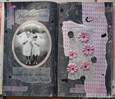
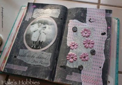
20130702_2348 20130702_2350 20130702_2349So here we are at week 4 of The Summer of Color with Charcoal Grey & Pale Pink. A much easier set of colors for me.

I had a bit of a hard time getting the right grey until I read on Elizabeth’s post that she puts a little purple into her grey’s to give it more intense color. It worked!! So happy….thanks E!

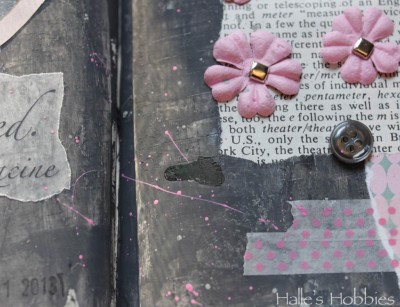
I’ve been doing a lot with splattering paint and inks lately. It seems  to add the texture I’m seeking.

I have to admit that this shot with those colors makes me think 1980’s…”like totally“. There are parts of the 1980’s worth reliving…

I’m also loving the texture I pressed into the grey. I was actually trying to stamp some black texture into it but the paint was still too wet. I decided to run with it.

I had some “help” taking my photos this morning…

words to live by


More art journaling…I can’t stop.  I’m hoping this will become a good habit of mine. The bad ones are too easy to pick up. :)

For so long I struggled, and likely will again, with art journaling. Lately, it’s all I want to do. I’ve even started another book, one from the public library’s free shelf. It’s a teen fiction book called Kira-Kira.

kira-kira (kee ra kee ra): glittering; shining

I loved that! Also since it’s a slightly smaller book, I thought it would be perfect for another art journal.
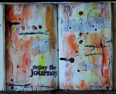
enjoy the journey

I turned to the middle of the book and started painting with my fingers. No thought…just went for it. I definitely thought I’d wrecked these pages several times over.
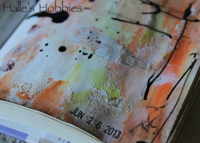
enjoy the journey2

First when I accidentally flopped the wet pages together, causing them to stick and tear away the top layer.
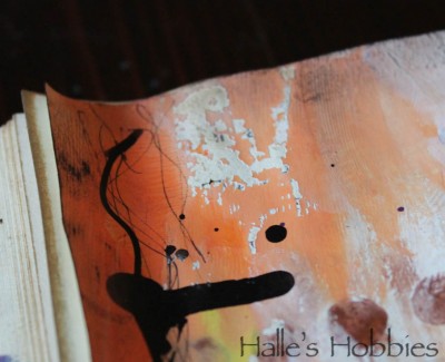
enjoy the journey4

But in fact, it created some really fun texture and effect that I could have never created on my own.
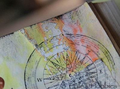
enjoy the journey5

Yummy, grungy texture…makes me so happy!!
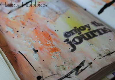
enjoy the journey3

The second and third time I thought I’d ruined the page was when I stamped the words with dye based in and it quickly faded and soaked into the painted page.  I went back with pigment ink and it was a really crappy image. I once again re-inked with pigment, carefully alining the stamp and finally got an image I could be happy about.  As it turns out, the dye based ink looks a bit like a shadow that I meant to have…happy accident.

I wish I didn’t have so many things on my plate today…I’d love to play with paint and paper all day!  What are you doing today?
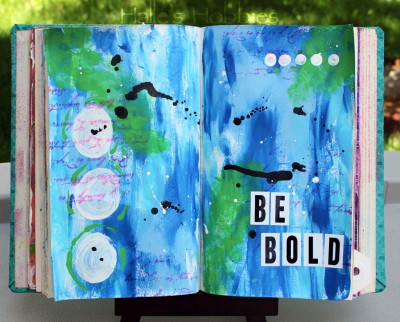
be boldThis page just sort of happened. I started with some blues and my fingers…threw in a little green…then a bit of stamping for background texture. Some circles of white made me happy…I love circles.

I squirted some black ink straight from the dropper then gave my brush with the white paint a little shake. I love the drips and splatters.

When I sat back and looked I thought…BE BOLD. Because I was…I didn’t over think it..I just did it.  So go ahead and be bold today!

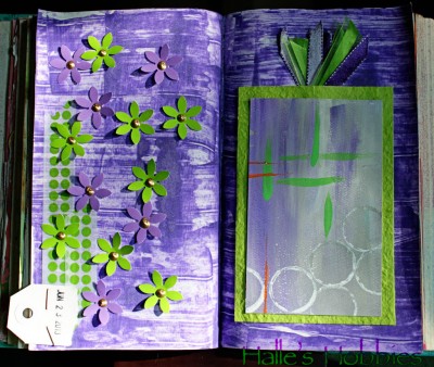
lime green and purple

These colors were definitely NOT my vote for the 3rd week of The Summer of Color challenge.

I started by spreading gesso on my cursed journal pages, let it dry, dragged purple craft paint over the top with an old credit card then immediately hated it.


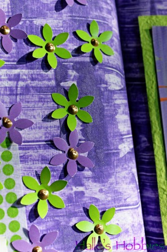
lime green and purple detail

Trying to salvage things I went with a technique I’ve previously only used on much sturdier substrate. I sprinkled baking soda over the wet purple paint. After it air-dried completely, I brushed away the excess baking soda to reveal a textured background that was much more appealing. The soda crystals even sparkle in the right light.

I had some previously painted watercolor paper with this weeks colors in my scrap bucket that I figured I’d make work.  After pulling together more pieces of lime green and purple the whole thing came together into something that’s not so bad after all.

PAGE TOP

© 2007-2024 Halle's Hobbies All Rights Reserved -- Copyright notice by Blog Copyright