I got my vintage vibe back today. I really felt like art journalling. Getting paint covered fingers and messy grungy pages was all I could think about.
I didn’t really give a whole lot of for thought other than wanting to use some really watered down sprays so show off the texture I was going to create.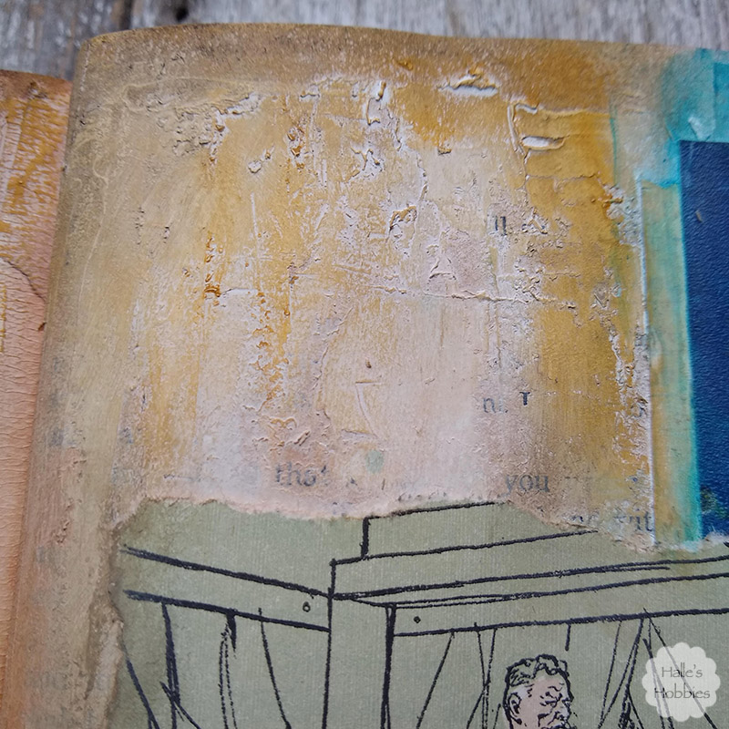
In the end I used gelatos and water color crayons as well to add the depth of color I sought.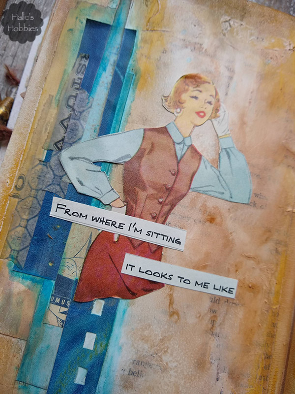
I layered strips of yellow and blue scraps on both sides of the spread before adding the first layers of color sprays. Layer upon layer until I got the look I desired. After I found this woman on a pattern envelope I knew she needed something sort of snarky to say. She just had that look about her.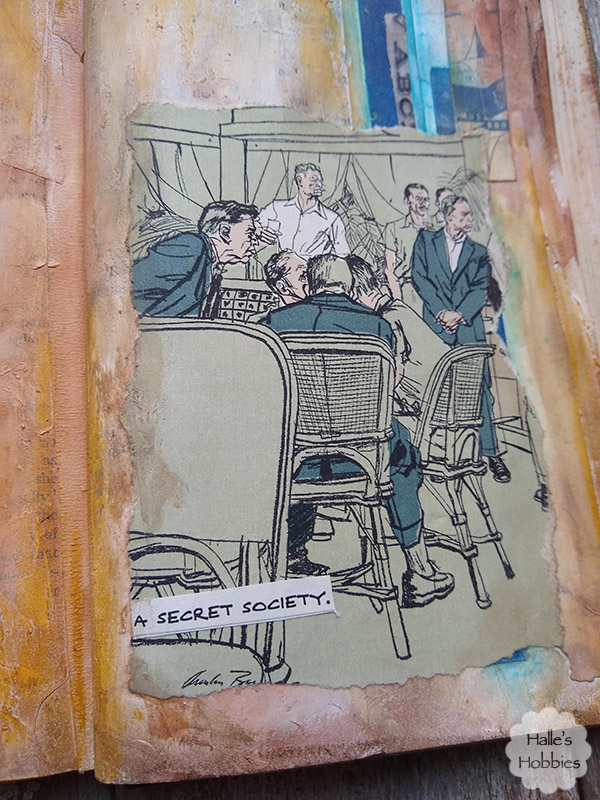 Then this image from one of the Reader Digest books I tore apart magically appeared. Well not magic but darn close…it was basically the first image I saw in the stack.
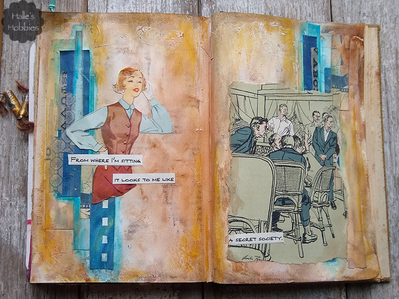
From where I’m sitting it looks to me like a secret society
Yep…in those days the ‘good old boys club’ pretty much was a secret society to women.



I think it does look like a secret society.And maybe someone is trying to get into their private space. They all seem to be looking in that direction. I love the strips of paper and the colors. It’s a cool background. Thanks so much for joining us at AJJ. Hope to see your art there again. Hugs-Erika
What a fun, fun, fun spread. I laughed at the sentiment, but fell in love with the many layers you gave us. Lots of depth and lots of texture. It’s a fabulous entry for Erika’s theme at Art Journal Journey. Thanks for joining us and it’s great to see you there.
Such a fun and well designed spread with such depth in layering and toughts! Great entry for AJJ1 Thank you for your entry Halle!
Hugs, Susi
Even now it looks like the Old Boys’ Club. When I think of the “We’ve come a long way, baby” ads from the 70s and look around at today… well, it doesn’t look to me like we’ve come _that_ far even now. Your spread is the perfect illustration of that quote.
Wow! You have used the perfect shade of blue to compliment the tan/oranges in your journal page. I like and admire how you have used those blue strips down one side of your page – it gives the right balance to the whole thing.
Fab!
Hugs, Neet x