These colors were definitely NOT my vote for the 3rd week of The Summer of Color challenge.
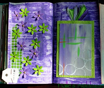
I started by spreading gesso on my cursed journal pages, let it dry, dragged purple craft paint over the top with an old credit card then immediately hated it.
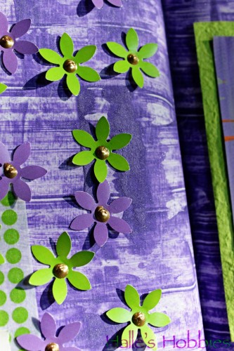
Trying to salvage things I went with a technique I’ve previously only used on much sturdier substrate. I sprinkled baking soda over the wet purple paint. After it air-dried completely, I brushed away the excess baking soda to reveal a textured background that was much more appealing. The soda crystals even sparkle in the right light.
I had some previously painted watercolor paper with this weeks colors in my scrap bucket that I figured I’d make work. After pulling together more pieces of lime green and purple the whole thing came together into something that’s not so bad after all.

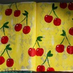
WOW, this is gorgeous, I LOVE IT!! The flowers are so pretty and kinda what I had in mind for this week too. Those gold dots in the middle and sparkle on the background are wonderful!!
So glad you could make this page work and be happy with it. I hate to admit it but these colors make me happy and I have played with them many times.
Fingers crossed your favorite ones get picked next week.
Peeked at your first two weeks pages and LOOOOVE THEM!!!
I’d say you pulled that off BEAUTIFULLY!
I think these colors look great together and you made them realy work for you.
xx
Never heard of the baking soda technique, but may need to try that sometime! This week’s color scheme isn’t my thing, but I’m going to try to make it work. You rocked it!
I think you did a great job. I can’t believe you don’t like the color combo. I’ve been anxiously awaiting this one. I love green and purple together.
oh wow!!! this is so beautiful!!!! what a great combo of dimension and colours!!! lovely work!!!!
What a great color combination! Fabulous journal page.
beautiful
Its looking great ! Strange but a lot of folk say they have struggled with this colour combo this week ! Ali #17
3D art with beautiful colors and subject. Great work!
I’m not too crazy about this combo either, but you have made a beautiful journal spread using the colors. Love the pocket and the flowers sprinkled on the page!
I laughed at your post as these were definitely not my choice for this week either! I really like what you came up with. I love how you achieved the background-it’s really effective.
Wow!! You totally nailed this color combo!! BEAUTIFULLY done!! Those flowers are divine! Still working on mine…will link up tomorrow :)
you truly make lime and purple beautiful!
I would say this is AWESOME. Much better than mine. For someone (like me) who didn’t care for the color combination, you did a spectacular job. Color me impressed!!
Well, you created lovely summer colors!!!
Beautiful page, very summery.
I love what you came up with! When I first saw the colour combination I thought ‘oh no’ as well but actually I ended up loving it. I think your art looks amazing and the colours work beautifully. Great job.
Your pages looks wonderful :). Yes, the color combo did make me scratch my head a bit but…it surely ended up being so fun.
looks amazing!
LOVE that shade of purple!
What lovely work, considering you didn’t like the colour combo! It’s beautiful and zingy!
Beautiful piece! <3
xo
This SOC color combo certainly was a tough one, but you did it beautifully!
nice work!
I love it great work!
ManonX
Lovely combinations of colours!
:) So many people have said it was not their vote, as I work through the list commenting I am wondering if maybe people clicked the wrong option!! Certainly wasn’t my vote either. :) I have never heard of using baking soda before, I am going to try that! :)
Very beautiful creation!!!! I love what you made for this color combo!
I think your journal pages are lovely! The colors are so vibrant and the green pops against the purple!