Tag : art journal

267 posts

I can’t believe The Summer of Color is nearing it’s end…or am I just being a glass half empty sort of gal today?  Regardless…here we are already at week 4 of 6.
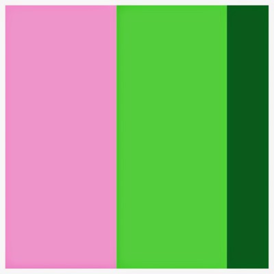
IMG_0019Pink & Apple Green with a Smudge, Splash or Pop of Dark Green

I took the liberty of choosing a brighter pink…mainly because from the computer..down the stairs to my art zone…I’d convinced myself that it was the neon pink color that was needed. 20140630_5607Not sure why…maybe I was having a 1980’s flash back.  Mallrats… Day glo…. Hypercolor…acid wash denim…  Anyone with me?
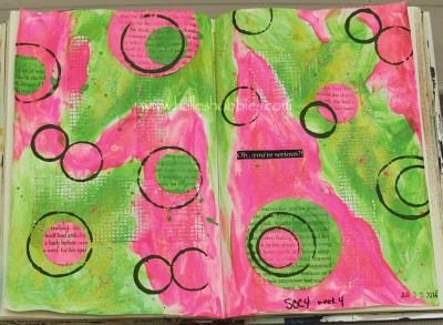
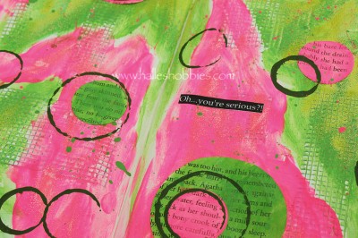
20140630_5611This little bit of text happened to fall into my lap…. I thought it was fitting.
Yikes…Kristen picked a little harder set of colors for me this 3rd week of The Summer of Color! On first inspection I thought….”sure, you got this”…but as it turned out…it was harder that I thought to come up with something.

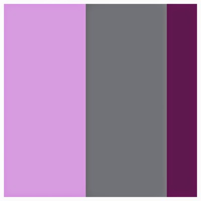
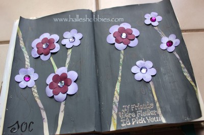
IMG_0011Lavender & Grey  with a Smudge, Splash or Pop of Plum

20140624_5408It’s not my favorite journal page. My grey paint was way thicker than I wanted so the page looks too “flat” to me.  Oh well…live and learn.

rp_soc4button.pngIt’s time play along again with Kristen for week 2 of The Summer of Color.

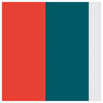
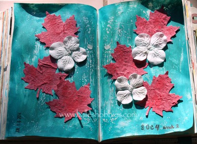
The palette for this week is:IMG_0008Coral & Teal 

with a Smudge, Splash or Pop of Bright White

This one was a little out of my comfort zone but that’s what this challenge is all about.coral and tealYou’ll just have to take my word for it that the coral is more coral.  I took over a dozen photos and played with them in Photoshop trying to get a realistic color representation of the real page but it was not meant to be today. My photo mojo is gone.

Thanks to everyone who stopped by over the past week to check out and comment on my week 1 entry. I’m hoping to make it around to everyone this week but I won’t make any promises.

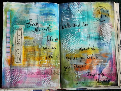
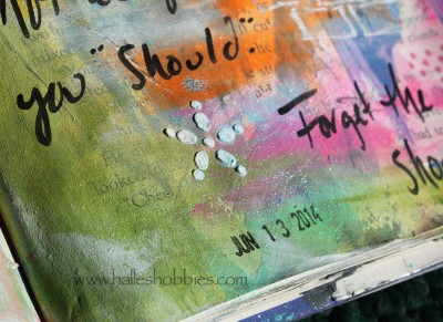
I’m definitely in a bright color sort of mode…something new for me.breakI’m not sure that my journaling would stand up to an English majors scrutiny but I never professed to being an expert at my native language. ;)break sparklesI do love the shimmer and bits of sparkles that are on this page. They are just so darn hard to capture on camera.

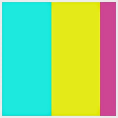
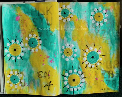
Kristen, our wonderful hostess for The Summer of Color 4, couldn’t have picked a better set of colors to start us out.week 1Aqua Blue & Yellow

With a Smudge, Splash or Pop of Hot Pink

Here’s my art journal page for today…

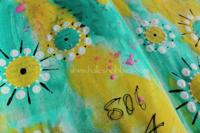
aqua and yellowLove, love these colors!!

aqua and yellow closeupI’m not sure if I’m going to label each weeks journal page with a SOC4 but today it just seemed right.

Go check out what my fellow SOC4 artists come up with this week. I know I’ll be checking them out daily.

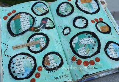
wishLayers and layers under the aqua. I finally settled on that color after auditioning several others. The others were definitely not right.

I’ve used this technique of making circles on my pages before. Highlighting little pieces of the page make it much more interesting. Having the layers underneath give wonderful texture to the page.

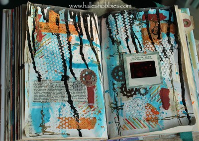
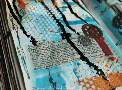
I took some quiet time yesterday to work in my kira-kira journal. It’s nearly full. Then I’ll just need to figure out what to do with the cover.exposureThe page came together with elements from my desk. I only had to go hunt for the vintage slide. As the page was coming together I just had to include a slide. I was lucky enough to find one in my stash that matched so very well.up close exposureI’m not sure how much I’ll be able to create in the next week. My clothes dryer broke so Mr. G will be taking it apart today. Since I share my art space with the laundry…my space will be severely limited. Not that I don’t have tons of other things that I could be doing.

PAGE TOP

© 2007-2024 Halle's Hobbies All Rights Reserved -- Copyright notice by Blog Copyright